
Introduction
In this article, we are going to get a detailed explanation of Matplotlib Visualizations in Python.
- Matplotlib is the most popular plotting library for Python.
- It gives you complete control over almost every aspect of a figure or plot.
- It was designed to have a similar feel to MatLab’s graphical plotting capabilities.
Matplotlib works very well with Pandas and NumPy Arrays which is why we’re going to learn everything about it. There are other visualization libraries like Seaborn and Plotly which are built on top of Matplotlib. But in order to understand those libraries, it is important to understand Matplotlib first.
Installation
You’ll need to install Matplotlib with pip or conda at your command line or the terminal with one of the following commands :
conda install matplotlibor
pip install matplotlibGetting Started
Once you have installed Matplotlib, the first thing you’re gonna able to do is import the Matplotlib library using the following command:
import matplotlib.pyplot as pltIf you’re using the Jupyter Notebook, you have to add another command:
%matplotlib inlineThe above command is going to allow you to actually see the plots that you create inside the Jupyter Notebook. If you’re not using the Jupyter Notebook System, you can add the following line of code at the end of the program:
plt.show()Let’s go ahead and walk through a very simple example using two numpy arrays.
import numpy as np
x=np.linspace(0,5,11)
y=x ** 2
Let me explain what the above code means. First, numpy has been imported as np, x is a linearly spaced array with three arguments — Lower Bound, Upper Bound, and the number of points. Here, the values of x range from 0-5 and there are 11 points in total. y is x raised to the power of two. If we try printing the values of x and y we get:

Now, basic Matplotlib commands allow you to very quickly create a plot and there are two ways of creating Matplotlib plots:
- Functional Method
- Object-Oriented method
The Functional method is actually quite simple. You just have to run the following command:
plt.plot(x,y)On running this command, we get the following plot:
So that’s the most basic way to plot something on Matplotlib. If we want to add X label, Y label, and title to this plot, we can do that with the following methods.
plt.xlabel('X Label')
plt.ylabel('Y Label')
plt.title('Title')
Let’s go ahead and continue on with creating multiple plots on the same canvas. In order to do that, we use:
plt.subplot()The subplot() function takes in a couple of arguments which we can see by pressing shift+tab.
The first argument is the number of rows and the second argument is the number of columns and then the plot number. Let’s go ahead and plot something:
plt.subplot(1,2,1)
plt.plot(x,y)

plt.subplot(1,2,2)
plt.plot(y,x)
We get the following output:
Hence, we get two plots on the same canvas. You can try this around by changing the number of rows and columns in the argument section and get multiple plots in one canvas.
Diving Deep into Matplotlib
Now what we’re gonna do is after we’ve seen the very basics of creating a plot we’re going to break this all down for a more formal approach to Matplotlib’s Object-Oriented API method. And this means that we’re going to instantiate figure objects and then call methods or attributes from that object. That’s going to be a much better way of using Matplotlib.
The main idea in using the more formal Object-Oriented Method is to create figure objects and then just call methods off of this.
First, we create a canvas:
fig=plt.figure()Then, we add other parameters to it,
axes=fig.add_axes([0.1,0.1,0.8,0.8])Now, we have a blank set of axes. The numbers inside the bracket are the dimensions of the axes. Once we have set the dimensions, we draw the plot using the following command:
axes.plot(x,y)Now we can see that we have come up with the same plot as earlier except this time, we have used the Object-Oriented method to plot.
Let’s go ahead and continue this idea of Object-Oriented programming with Matplotlib by putting in two sets of figures on one canvas.
fig=plt.figure()

axes1=fig.add_axes([0.1,0.1,0.8,0.8])
axes2=fig.add_axes([0.2,0.5,0.4,0.3])
Hence, we get axes inside bigger axes. We can play around with the position of the axes by changing the dimensions. Plotting in these axes is the same way as we discussed earlier.
This is the sort of methodology we’re going to be working with for Matplotlib.
Formatting the Style of the Plot
In this part, we are going to discuss setting colors, line width, line types and really customizing the options of how your plot actually looks.
First, let’s discuss the basics of color we want to add to our plots. In the above plots, we have not added the color parameter in the code hence the line plots are blue in color. Blue is the default color for plots. If we change the parameter and assign the value with a particular color string the color of the plot will change. Consider the following code snippet:
fig=plt.figure()
ax=fig.add_axes([0,0,1,1])
ax.plot(x,y,color='red')
Here we can see that the plot is red in color. We can use other basic color strings in the color parameter like yellow, green, purple, etc. If you want a more customized version of the color you can use RGB Hex codes.
Now, let’s talk about the line style and line width. If you want to edit the line width, you can actually just pass in line width as an argument and just put in a number. The default line width is ‘1’. If you want a thicker line you can use a larger value for the line width parameter.
fig=plt.figure()
ax=fig.add_axes([0,0,1,1])
ax.plot(x,y,color='purple',linewidth=5)
Similarly, we can also reduce the width of the line by using a value less than ‘1’ say, ‘0.5’ and we will get a thinner line.
Another very useful tip as far as the line width and line visibility is concerned is the use of alpha argument. The alpha argument allows you to basically control how transparent the line is. Consider the following code:
fig=plt.figure()
ax=fig.add_axes([0,0,1,1])
ax.plot(x,y,color='purple',linewidth=5,alpha=0.5)
Note that the above plot is more transparent than the previous plot.
So you can combine color, line width and, alpha in order to get the exact appearance that you want.
We can change the line styles as well. A detailed exploration of the same with codes is given here.
Next, we’ll talk about markers. Markers are used when you have just a few data points. For instance, x is just an array of 11 data points. Let’s say we actually wanted to mark those data points where they occur on the plot. So we just add the marker argument and pass a string.
fig=plt.figure()
ax=fig.add_axes([0,0,1,1])
ax.plot(x,y,color='purple',linewidth=1,marker='o')
For this, we get:
Apart from line plots, we can also plot Histograms, Bar Charts, Box Plots, Pie Charts, etc. The code to which is given in the documentation.
For example, let’s plot a histogram:
from random import sample
data = sample(range(1, 1000), 100)
plt.hist(data)
Let’s try plotting a Boxplot.
data = [np.random.normal(0, std, 100) for std in range(1, 4)]

# rectangular box plot
plt.boxplot(data,vert=True,patch_artist=True);
Advanced Matplotlib Concepts
With the grid method in the axis object, we can turn on and off gridlines. We can also customize the appearance of the grid lines using the same keyword arguments as the plot function:
fig, axes = plt.subplots(1, 2, figsize=(10,3))

# default grid appearance
axes[0].plot(x, x**2, x, x**3, lw=2)
axes[0].grid(True)

# custom grid appearance
axes[1].plot(x, x**2, x, x**3, lw=2)
axes[1].grid(color='b', alpha=0.5, linestyle='dashed', linewidth=0.5)
In addition to the regular plot method, there are a number of other functions for generating different kinds of plots. See the Matplotlib plot gallery for a complete list of available plot types. Some of the more useful ones are shown below:
n = np.array([0,1,2,3,4,5])

fig, axes = plt.subplots(1, 4, figsize=(12,3))

axes[0].scatter(xx, xx + 0.25*np.random.randn(len(xx)))
axes[0].set_title("scatter")

axes[1].step(n, n**2, lw=2)
axes[1].set_title("step")

axes[2].bar(n, n**2, align="center", width=0.5, alpha=0.5)
axes[2].set_title("bar")

axes[3].fill_between(x, x**2, x**3, color="green", alpha=0.5);
axes[3].set_title("fill_between");
Annotating text in Matplotlib figures can be done using the text function. It supports LaTeX formatting just like axis label texts and titles:
fig, ax = plt.subplots()
ax.plot(xx, xx**2, xx, xx**3)

ax.text(0.15, 0.2, r"$y=x^2$", fontsize=20, color="blue")
ax.text(0.65, 0.1, r"$y=x^3$", fontsize=20, color="green");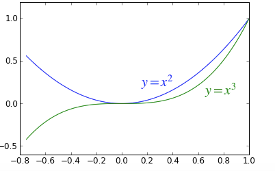
Axes can be added to a Matplotlib Figure canvas manually using fig.add_axes or using a sub-figure layout manager such as subplots, subplot2grid, or gridspec:
fig, ax = plt.subplots(2, 3)
fig.tight_layout()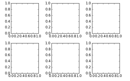
fig = plt.figure()
ax1 = plt.subplot2grid((3,3), (0,0), colspan=3)
ax2 = plt.subplot2grid((3,3), (1,0), colspan=2)
ax3 = plt.subplot2grid((3,3), (1,2), rowspan=2)
ax4 = plt.subplot2grid((3,3), (2,0))
ax5 = plt.subplot2grid((3,3), (2,1))
fig.tight_layout()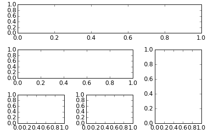
import matplotlib.gridspec as gridspec
fig = plt.figure()


gs = gridspec.GridSpec(2, 3, height_ratios=[2,1], width_ratios=[1,2,1])
for g in gs:
    ax = fig.add_subplot(g)

fig.tight_layout()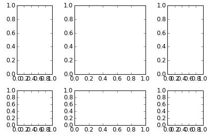
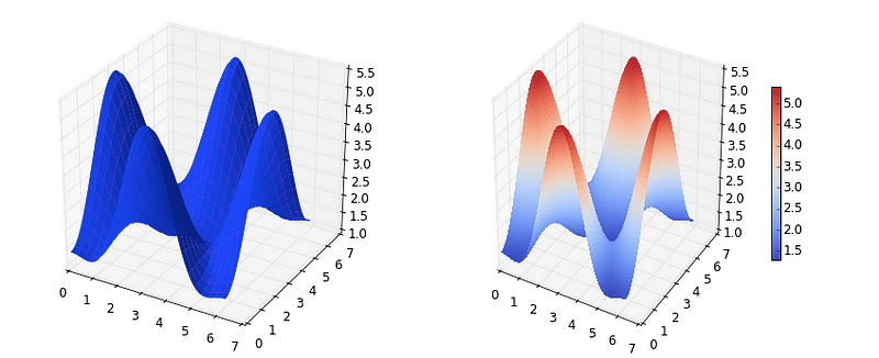
To use 3D graphics in Matplotlib, we first need to create an instance of the Axes3D class. 3D axes can be added to a Matplotlib figure canvas in exactly the same way as 2D axes; or, more conveniently, by passing a projection=’3d’ keyword argument to the add_axes or add_subplot methods.
from mpl_toolkits.mplot3d.axes3d import Axes3D
fig = plt.figure(figsize=(14,6))

# `ax` is a 3D-aware axis instance because of the projection='3d' keyword argument to add_subplot
ax = fig.add_subplot(1, 2, 1, projection='3d')

p = ax.plot_surface(X, Y, Z, rstride=4, cstride=4, linewidth=0)

# surface_plot with color grading and color bar
ax = fig.add_subplot(1, 2, 2, projection='3d')
p = ax.plot_surface(X, Y, Z, rstride=1, cstride=1, cmap=matplotlib.cm.coolwarm, linewidth=0, antialiased=False)
cb = fig.colorbar(p, shrink=0.5)
# Wireframe plot
fig = plt.figure(figsize=(8,6))

ax = fig.add_subplot(1, 1, 1, projection='3d')

p = ax.plot_wireframe(X, Y, Z, rstride=4, cstride=4)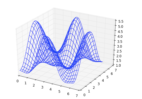
Summary
In this post, we have seen a detailed review of Matplotlib from the very basics to advanced techniques. The most important things that we learned are:
- The functional method, and
- Object-Oriented Method of plotting the graphs
We have also seen how we can customize the graphs according to our needs.
For Further Reading, you can refer to:
- http://www.matplotlib.org – The project web page for matplotlib.
- https://github.com/matplotlib/matplotlib – The source code for matplotlib.
- http://www.loria.fr/~rougier/teaching/matplotlib – A good matplotlib tutorial.
Thanks for reading and have a Good Day!


